…want to read or learn about? I have no skill for frontend design, but I've recently begun to learn how to display data in an intelligent manner. If anyone is interested, these books have helped me: Information Dashboard Design: http://oreilly.com/catalog/9780596100162 Visualizing Data: http://www.amazon.com/Visualizing-Data-Explaining-Processing... Beautiful Data: http://www.amazon.com/Beautiful-Data-Stories-Elegant-Solutio...
……图表。我推荐楼主(以及任何对信息传达感兴趣的人)读读这些:《定量信息的视觉呈现》(The Visual Display of Quantitative Information)http://www.amazon.co.uk/The-Visual-Display-Quantitative-Info... 《信息仪表盘设计》(Information Dashboard Design)http://www.amazon.co.uk/Information-Dashboard-Design-Effecti... 《Now You See It》http://www.amazon.co.uk/Now-You-See-Stephen-Few/dp/097060198...
…Charts. I'd recommend the OP (and anyone else who has an interest in communication) to read: The Visual Display of Quantitative Information http://www.amazon.co.uk/The-Visual-Display-Quantitative-Info... Information Dashboard Design http://www.amazon.co.uk/Information-Dashboard-Design-Effecti... Now You See http://www.amazon.co.uk/Now-You-See-Stephen-Few/dp/097060198...
……教你如何在页面或屏幕上进行有效且美观的内容排版。底层原则都是一样的。掌握了排版之后,你可以通过像仪表盘(比如斯蒂芬·菲尤的《信息仪表盘设计》Information Dashboard Design)或其他“实用性”课题切入视觉设计,而完全不需要非得把自己搞成个真正的艺术家。如果你想更深入地了解视觉设计,我送出过好几本大卫·卡达维的《写给黑客的设计书》(Design for Hackers),而且……
…you effective and attractive positioning of content on a page or on a screen. The principles are all the same. From layout you can get into visual design through things like dashboards (Stephen Few's _Information Dashboard Design_) or other "practical" subjects without ever getting into becoming an actual artist. If you want to get more into visual design, I've given out a few copies of David Kadavy's _Design for Hackers_, and…
I will suggest checking out following resources: Books * Nathan Yau, Data Points Visualization that means something * Stephen Few, Information Dashboard Design The effective communication of data * OReilly, Visualizing Data Software * Tableau and example visualizations * D3.js and example visualizations
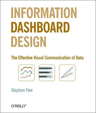
不如看看爱德华·塔夫特(Edward Tufte)的《定量信息的视觉呈现》(The Visual Display of Quantitative Information)及后续著作,以及斯蒂芬·菲尤(Stephen Few)的《信息仪表盘设计》(Information Dashboard Design)
See instead Tufte, Edward: The Visual Display of Quantitative Information (and the followup books) Few, Stephen: Information Dashboard Design
《点石成金》(Don't Make Me Think)- 史蒂夫·克鲁克;《信息仪表盘设计》(Information Dashboard Design)- 斯蒂芬·菲尤
Don't Make Me Think - Steve Krug Information Dashboard Design - Stephen Few
……想读或者想学哪方面的?我完全不懂前端设计,但最近开始学怎么用明智合理的方式来展示数据。如果有朋友感兴趣,这几本书帮了我不少:Information Dashboard Design: http://oreilly.com/catalog/9780596100162 Visualizing Data: http://www.amazon.com/Visualizing-Data-Explaining-Processing... Beautiful Data: http://www.amazon.com/Beautiful-Data-Stories-Elegant-Solutio...
…want to read or learn about? I have no skill for frontend design, but I've recently begun to learn how to display data in an intelligent manner. If anyone is interested, these books have helped me: Information Dashboard Design: http://oreilly.com/catalog/9780596100162 Visualizing Data: http://www.amazon.com/Visualizing-Data-Explaining-Processing... Beautiful Data: http://www.amazon.com/Beautiful-Data-Stories-Elegant-Solutio...
……图表。我推荐楼主(以及任何对信息传达感兴趣的人)读读这些:《定量信息的视觉呈现》(The Visual Display of Quantitative Information)http://www.amazon.co.uk/The-Visual-Display-Quantitative-Info... 《信息仪表盘设计》(Information Dashboard Design)http://www.amazon.co.uk/Information-Dashboard-Design-Effecti... 《Now You See It》http://www.amazon.co.uk/Now-You-See-Stephen-Few/dp/097060198...
…Charts. I'd recommend the OP (and anyone else who has an interest in communication) to read: The Visual Display of Quantitative Information http://www.amazon.co.uk/The-Visual-Display-Quantitative-Info... Information Dashboard Design http://www.amazon.co.uk/Information-Dashboard-Design-Effecti... Now You See http://www.amazon.co.uk/Now-You-See-Stephen-Few/dp/097060198...
……教你如何在页面或屏幕上进行有效且美观的内容排版。底层原则都是一样的。掌握了排版之后,你可以通过像仪表盘(比如斯蒂芬·菲尤的《信息仪表盘设计》Information Dashboard Design)或其他“实用性”课题切入视觉设计,而完全不需要非得把自己搞成个真正的艺术家。如果你想更深入地了解视觉设计,我送出过好几本大卫·卡达维的《写给黑客的设计书》(Design for Hackers),而且……
…you effective and attractive positioning of content on a page or on a screen. The principles are all the same. From layout you can get into visual design through things like dashboards (Stephen Few's _Information Dashboard Design_) or other "practical" subjects without ever getting into becoming an actual artist. If you want to get more into visual design, I've given out a few copies of David Kadavy's _Design for Hackers_, and…
我建议看看以下资源:书籍类 * 内森·尧(Nathan Yau)《数据之美》(Data Points: Visualization that Means Something) * 斯蒂芬·菲尤(Stephen Few)《信息仪表盘设计:数据的有效传达》(Information Dashboard Design) * O'Reilly 的《数据可视化》(Visualizing Data);软件类 * Tableau 及相关可视化范例 * D3.js 及相关可视化范例
I will suggest checking out following resources: Books * Nathan Yau, Data Points Visualization that means something * Stephen Few, Information Dashboard Design The effective communication of data * OReilly, Visualizing Data Software * Tableau and example visualizations * D3.js and example visualizations