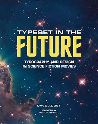
以未来排版
Typeset in the Future
Dave Addey、Matt Zoller Seitz · 初版 2018 年
4人推荐
4位读者提及
4次提及
在Typeset in the Future一书中,博主兼设计师Dave Addey邀请科幻电影爱好者踏上一场跨越七部定义流派的经典之作的旅程,探索它们如何通过字体排印与设计构筑出引人入胜的未来景象。本书深入探讨了2001: A Space Odyssey、Star Trek: The Motion Picture、Alien、Blade Runner、Total Recall、WALL*E以及Moon,研究了让每部电影超越单纯的胶片并化为逼真现实的设计手法与灵感。这些研究辅以电影剧照、概念艺术图、字体范本和周边资料,并收录了原创访谈
Hacker News 上怎么说
正在加载完整评论……
关于电影中的字体排印、UI 和代码,还有一些其他有趣的资源:Typeset in the Future(书籍和网站):https://typesetinthefuture.com/ Behind the Screens(YouTube 频道):https://www.youtube.com/channel/UCzOc0EEdwWAlnwrWV-7sDbg
Some other interesting resources about typography, user interfaces, and coding in movies: Typeset in the Future (book and website): https://typesetinthefuture.com/ Behind the Screens (YouTube channel): https://www.youtube.com/channel/UCzOc0EEdwWAlnwrWV-7sDbg
我也建议去逛逛“Typeset in the Future”网站 [1]。它对好几部电影进行了深度扒皮,试图找出画面中出现的字体——不仅包括片名 logo,还包括各种标签、世界观内部的徽标等等。我最喜欢的是关于《2001太空漫游》(2001 Space……
I would also recommend checking out the "Typeset in the Future" website [1]. It does a bit of a deep dive on several films, trying to identify the fonts visible, not only on the title logos, but also on labels, in-universe logos, etc. My favorite is the 2001 Space…
没错,字体确实不咋地。他们早该读读 Typeset In The Future 那篇关于《银翼杀手》(Blade Runner)的博文了:https://typesetinthefuture.com/2016/06/19/bladerunner/
Yep, fonts are not great. Should have read the Typeset In The Future blog post on Blade Runner: https://typesetinthefuture.com/2016/06/19/bladerunner/
很酷的文章,细节侦探功力拉满。感觉完全可以直接收进《Typeset in the Future》那本书里了!
Cool article, nice sleuthing. Could be straight out of the “Typeset in the Future” book!