You also get to see how "real typefaces" are produced using Metafont (namely, doing outlines and then filling them), which may not be crystal clear when reading the Metafontbook alone. (I also like the book for a much simpler reason: it got me my Knuth cheque)
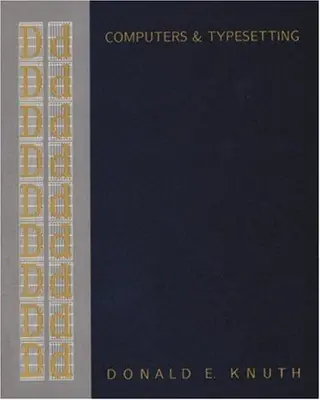
…mf.web to generate TeX sources for a camera-ready, exhaustively commented version of the source code that has even been published in hardcover[1]. [1] http://www.amazon.com/Computers-Typesetting-Volume-Metafont-...
…it looks great. The reason is that Knuth uses bitmap (raster) fonts, not vector fonts like the rest of the world. Once bitten by “advances” in font technology (his original motivation to create TeX & METAFONT), he now prefers to use bitmap fonts and completely specify the appearance (when printed/viewed on a sufficiently high-resolution device anyway), rather than use vector fonts where the precise rasterization…
Knuth wrote the entirety of the first version of TeX on yellow legal note pads, and then typed it all in, and then started debugging. Ditto for MetaFont. Both are the equivalent of about 10kloc (after the Tangle preprocessor removes the voluminous comments).
……在 WEB 里)”。Knuth 是这样描述从 SAIL 到 WEB 的重写的:“我需要想出一套更好的‘残局策略’,很快就清楚了该做什么:TEX 和 METAFONT 的原始版本应该被废弃,因为它们已经完成了自己的使命——积累了足够多的用户经验,足以说明这类语言应该是什么样子。应该写出 TEX 和 METAFONT 的新版本,设计……
…in WEB)" Here is how Knuth described the rewrite from SAIL to WEB: "I needed to work out a better 'endgame strategy', and it soon became clear what ought to be done: the original versions of TEX and METAFONT should be scrapped, once they had served their purpose of accumulating enough user experience to indicate what such languages ought to be. New versions of TEX and METAFONT should be written, designed…
…of the books. (The layout was fine; the publishers were trying to move to phototypesetting and the fonts were poor https://tex.stackexchange.com/questions/367058, so he needed digital fonts and wrote METAFONT to create them, and he needed TeX just to be able to use those fonts.) Perhaps the book Concrete Mathematics will be a better example for you to critique, as Knuth had more of a hand in its typesetting…
你还能看到“真正的字体”是如何用 Metafont 制作的(即先做轮廓再填充),如果只读《Metafontbook》可能不会那么清楚。(我也喜欢这本书,原因更简单:它让我拿到了 Knuth 的支票)
You also get to see how "real typefaces" are produced using Metafont (namely, doing outlines and then filling them), which may not be crystal clear when reading the Metafontbook alone. (I also like the book for a much simpler reason: it got me my Knuth cheque)
……mf.web 生成 TeX 源码,得到一个可直接付印、注释详尽到极点的源代码版本,甚至还出了精装版[1]。[1] http://www.amazon.com/Computers-Typesetting-Volume-Metafont-……
…mf.web to generate TeX sources for a camera-ready, exhaustively commented version of the source code that has even been published in hardcover[1]. [1] http://www.amazon.com/Computers-Typesetting-Volume-Metafont-...
……它看起来很棒。原因是 Knuth 使用的是位图(光栅)字体,而不是世界上其他人用的矢量字体。一旦被字体技术的“进步”咬过(他最初创建 TeX 和 METAFONT 的动机),他现在就更喜欢用位图字体,并完全指定外观(反正是在足够高分辨率的设备上打印/查看时),而不是用矢量字体,因为精确的光栅化……
…it looks great. The reason is that Knuth uses bitmap (raster) fonts, not vector fonts like the rest of the world. Once bitten by “advances” in font technology (his original motivation to create TeX & METAFONT), he now prefers to use bitmap fonts and completely specify the appearance (when printed/viewed on a sufficiently high-resolution device anyway), rather than use vector fonts where the precise rasterization…
Knuth 把 TeX 第一版整个写在黄色的 legal 便笺本上,然后全部敲进电脑,再开始调试。MetaFont 也一样。两者在 Tangle 预处理器去掉海量注释之后,都相当于大约 10kloc。
Knuth wrote the entirety of the first version of TeX on yellow legal note pads, and then typed it all in, and then started debugging. Ditto for MetaFont. Both are the equivalent of about 10kloc (after the Tangle preprocessor removes the voluminous comments).
……在 WEB 里)”。Knuth 是这样描述从 SAIL 到 WEB 的重写的:“我需要想出一套更好的‘残局策略’,很快就清楚了该做什么:TEX 和 METAFONT 的原始版本应该被废弃,因为它们已经完成了自己的使命——积累了足够多的用户经验,足以说明这类语言应该是什么样子。应该写出 TEX 和 METAFONT 的新版本,设计……
…in WEB)" Here is how Knuth described the rewrite from SAIL to WEB: "I needed to work out a better 'endgame strategy', and it soon became clear what ought to be done: the original versions of TEX and METAFONT should be scrapped, once they had served their purpose of accumulating enough user experience to indicate what such languages ought to be. New versions of TEX and METAFONT should be written, designed…
……这些书的。(排版没问题;出版商正试图转向照相排版,而字体很差 https://tex.stackexchange.com/questions/367058,所以他需要数字字体,于是写了 METAFONT 来创建它们,而他需要 TeX 只是为了能够使用这些字体。)也许《Concrete Mathematics》会是你批评的更好例子,因为 Knuth 在其排版中参与得更多……
…of the books. (The layout was fine; the publishers were trying to move to phototypesetting and the fonts were poor https://tex.stackexchange.com/questions/367058, so he needed digital fonts and wrote METAFONT to create them, and he needed TeX just to be able to use those fonts.) Perhaps the book Concrete Mathematics will be a better example for you to critique, as Knuth had more of a hand in its typesetting…